Open topic with navigation
The Simple Form Layout Properties dialog provides flexible capabilities for controlling the format structure for the form layout, to meet the needs of the page and content. Display this dialog by selecting Layout from the Element menu within a page.

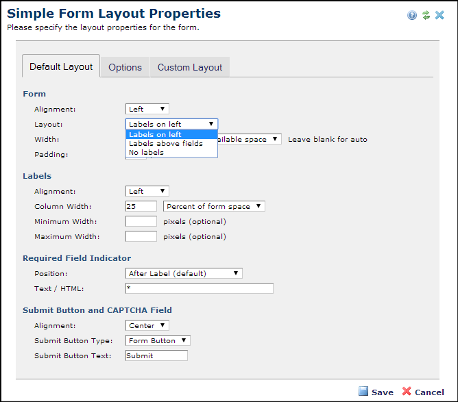
Simple Form Layout Properties - Default Layout Tab
This tab has the following fields.
Form - Determines the width of the form on the page in percentage of available space, or in pixels. Cell padding can also be set.
- Alignment - Pick from the dropdown to set form position (left, right, or center ) within the page or block.
- Layout - Label Column Width is set in pixels or in percentage of form size. The Input Column Width field must also use the same measure, in this case, percentage.
- Width - Input Column Width is set in pixels or in percentage of form size. The Label Column Width field must also use the same measure, in this case a percentage.
- Padding - Ener the amount of spacing between items, in pixels.
Labels - Determines the position and width of form field labels.
- Alignment - Pick from the dropdown to set horizontal alignment for the label to left, right or center.
- Column Width – Enter a column width value in pixels or in percentage of form size. The Label Column Width field must also use the same measure, in this case a percentage.
- Minimum Width – Optionally enter a minimum label width in pixels.
- Maximum Width - Optionally enter a maximum label width in pixels.
Required Field Indicator – Determines the position of the symbol used to indicate required fields.
- Position Pick from the dropdown to set position relative to the label.
Submit Button and CAPTCHA Field - Determines alignment for the CAPTCHA field and the button to use for submit.
- Alignment Pick from the dropdown to set horizontal alignment for the CAPTCHA field and the Submit button to left, right, or center.
- Submit Button Type – Pick from the dropdown to choose an image or a standard button type for the form Submit button. If you choose an image, clicking the Select Image button opens the Image Properties dialog. Choose an existing image from your image galleries, or upload a new image. See the Contributor's Reference for details.
- Submit Button Text – This option displays if you pick a standard type for the form Submit button. Optionally customize button text.
Simple Form Layout Properties - Options Tab
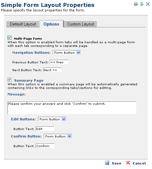
The Options tab of the Simple Form Layout Properties dialog provides two additional options to customize the layout of your form.

- Multi-Page Form - This option is available for forms with multiple tabs. If you check this option, CommonSpot displays each tab on a separate page. If unchecked, CommonSpot presents all of the fields in the tabs on one page. If you select Multi-Page Form, CommonSpot displays the fields shown above.
- Navigation Buttons: Pick from the dropdown to use either standard text navigation or an image. Optionally customize navigation between pages, by defining the Next and Previous button layouts. Choosing an image for navigation displays the Select Image button. Click Select Image to open the Image Properties for choosing an existing image or uploading a new image. See the Contributor's Reference for details.
- Summary Page - Check this option to display all user-entered values for review and optional revision. As with navigation for a multi-page form, you can define the layout of the Edit buttons, and use either a standard form button or an image. You can also specify the text that CommonSpot displays at the top of the summary page using the Message field. Selecting the Summary Page option displays the fields shown above.
- Message: Enter a text message, as shown above.
- Edit Buttons: Pick from the dropdown to choose an image or a standard button type for the form editing. If you choose an image, clicking the Select Image button opens the Image Properties dialog. Choose an existing image from your image galleries, or upload a new image. See the Contributor's Reference for details.
- Confirm Button: Pick from the dropdown to choose an image or a standard button type for confirming form entries. If you choose an image, clicking the Select Image button opens the Image Properties dialog. Choose an existing image from your image galleries, or upload a new image. See the Contributor's Reference for details. If you choose a standard button type, optionally customize the confirm button text.
Simple Form Layout Properties - Custom Layout Tab
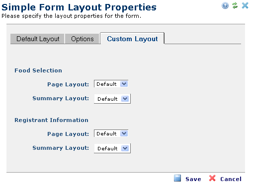
The Custom Layout tab of the Simple Form Layout Properties dialog allows you to either accept the default layout, or customize the way data appears on the page. CommonSpot provides extensive flexibility in the way it renders your form, allowing you to modify the display layout for simple form fields beyond what is provided out of the box on the page and/or on the summary page. Similar to the process used to create Display Masks for Custom Elements, you can define fonts, colors, styles, and placement of fields, using the Rich Text Editor.
Note: The “Custom Layout” tab is not available until one or more fields are added to the Simple Form.

You can customize both the data entry screen for each tab, and, if Summary Page is checked in the Options tab, the way data for that tab displays.

Optionally select Custom from the drop-down, then click the Edit button to open the Simple Form Custom Layout dialog to design your form.
Related Links
You can download PDF versions of the Content Contributor's, Administrator's, and Elements Reference documents from the support section of paperthin.com (requires login).
- Developer's Guide
- Template Developer's Guide
- Shared Database Configuration Guide
- Replication vs Shared Database Guide
Sites upgrading from versions earlier than release 6.0 should review the following (from the support section of paperthin.com - requires login):
- What's New in CommonSpot 6.0
- CommonSpot 6.0.0 Menu Quick Reference
For technical support:
http://www.paperthin.com/support/
Open topic with navigation
